Man, it's been a while since we did a Who Wore It Better, and in that time, we've come up with lots of fabulous series to feature, including one of my more well known and enjoyed series, Starcrossed by Josephine Angelini. I really loved this series with all it's Greek Mythology and it's romance and secondary characters (basically Hector was my baby and I love him so), so I'm so pleased to be featuring it this week. You can check out my reviews for Starcrossed series, and Nitzan's WWIB featuring Starcrossed.
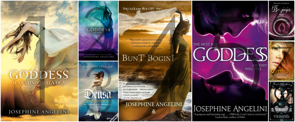
Goddess Book Covers

1. Italian | 2. American | 3. Portuguese | 4. Polish | 5. English | 6. Serbian | 7. German | 8. Swedish
My Thoughts
- Italian: Oh, it was so close choosing between the Italian and the American cover, but I think it was the colours, the tone and the actual model that won out. The model herself just reminds me so much of Helen, as does the tone and the whole scene, her being in the air and flying, her being such a high goddess and important character, and the yellows of a new dawn, it's such a beautiful cover, and definitely my favourite.
- American: I do oh so love this cover, the pose and the feel is so beautiful and serene, my only issue is that it feels too dark. The rich colours take away from the elegant feel personally, and while I would own the heck out of it, it's not enough to take top spot, which is a shame. That and the actual cover is shiney, not for me sadly.
- Portuguese: Good god, such a beautiful cover, and the colours, the blues and the whites, they're so so pretty to admire, but the model, she is but not my Helen, and although there's a feel of innocence and purity, such as Helen of Troy, and the seaside/island feel is relative to the world, but it's just not quite what I like.
- Polish: As pretty as this cover is, I just feel as though it's missing a softness to it, something that looks elegant and smooth, and the colours and tones are a little darker than the Italian, which is a shame, otherwise this could be an absolutely gorgeous cover too.
- English: I think my main issue with this is that really really vibrant use of purple.. Don't get me wrong, I love me some purple, but I like lighter, less harsher tones, and while I do think the purple works well with the feel of battle, and that the couple facing off, facing each other, they're fears, works, it's just too - not me.
- Serbian: Purple, again. This purple is a little less in my face but what on earth is actually going on here? Is she in a huge hallway? Why is she in a ballgown dress? This doesn't work with, or give any indication of the actual plot, genre or characters. *sighs* It's pretty though..
- German: Face covers are usually a big NOPE from me at the best of times, I just don't have a clue what they were aiming for here. Points to getting a model that at least feels a little like Helen, but the eyes, the border, the whole look? Nah.
- Swedish: Who Wore It Better's have never been friendly towards the Swedes, and I hate to say it, but this cover just is not working at all. I don't mind the darker background, but there's just too much going on.. The lightning, the half there-half not models, the greek mythology symbols, I'm just - it's not appealing to me whatsoever.
The purple ones don't look... right to me. Like you said, they're pretty harsh and I think I love the American one the best because of the amount of colors they used. They're very similar [one and two] which is an awesome thing!
ReplyDeleteI miss this post <33
I do have a soft spot for the American cover, I think it's the prospect of it being shiney, not good for me. I'm so glad you like WWIB though Nova, it's been a while, but we're glad to be back, we missed it too!<3
DeleteI'm with you, I love the overall elegant look of the cover (of all the books in this series!) I had no idea Goddess had so many different covers :O 7 and 8 really deviated from the theme the others did, interesting. Yeah 1 and 2 are so close but I like the Italian better.
ReplyDeleteI had no idea myself either Alise, I was prepared for 4-5, so to find 8 was such a positive!<3
DeleteI think I prefer the US one the best! I mean, I like them all, but that one seems to be the best. I also quite like the Italian one! :)
ReplyDeleteGreat minds think alike and love alike clearly, the publishers did well with those covers for sure!<3
DeleteI think it's close between the Italian and the American!! I think I'll go with the Italian. It's so pretty!! I still need to read this series... Fun post :)
ReplyDeleteRachel @ A Perfection Called Books
Thanks Rachel! I would definitely recommend the series, it's a great romantic mythology story!<3
DeleteI don't even know which one I like more. I don't really like any of them but I'm not sure why. I think the American cover might be my favourite out of them all, not sure why though.
ReplyDeleteIt does like extremely pretty, so I'm not surprised you like that one mst! Such a variety though!<3
DeleteI like the first three. But I'm torn between the Italian and the American covers. They are both beautiful.
ReplyDeleteThey are indeed, I hate when covers are all gorgeous, makes the choice so hard!<3
Delete